Atlass Metal
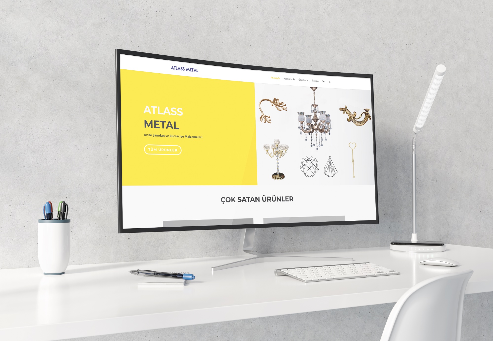
For Atlass Metal, which makes chandeliers, candlesticks and glassware, we designed a website that sorts products into categories and features best sellers, and prepared the site for launch with graphic design and basic SEO work.
Atlass Metal is a company that makes chandeliers, candlesticks and glassware. Its product range is wide, so it needed an orderly, trustworthy website where customers could quickly find the piece they were looking for.
Services Provided
Web Design
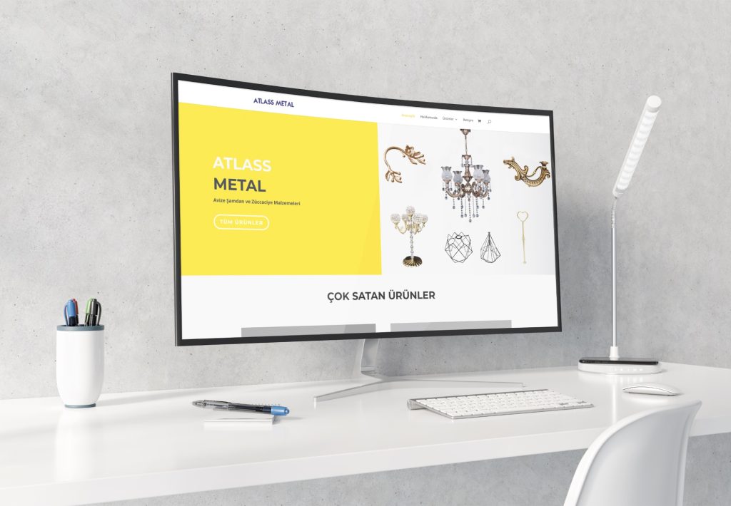
We designed a website with a menu that sorts products into categories and a “Best Sellers” section that takes visitors straight to the product. The interface is clean: a yellow and navy balance catches the eye, and product photos appear clearly on a white background.
Graphic Design
We prepared the homepage banners, category visuals and product display areas in line with the brand’s colors. We also created compositions that show items such as chandelier arms, candlesticks and decorative pieces together in an orderly way.
Basic SEO
We set up the basic SEO elements, including page titles, descriptions, the URL structure of product and category pages, and image alt text, to lay the groundwork for the site to be listed correctly in search engines.
Project Summary
Client: Atlass Metal
Industry: Manufacturing (chandeliers, candlesticks and glassware)
Year: 2020
Services Offered:
- Web Design
- Graphic Design
- Basic SEO
Result: Atlass Metal now has a website that presents its wide product range in an orderly, easy-to-follow way and is ready for search engines.
A closer look at the Atlass Metal project
One question was at the center of our work for Atlass Metal: how does a manufacturer that offers many different pieces get visitors to the product they want by the shortest route? In this section we explain where the project started, why the three services we provided matter in this industry, and what similar companies should pay attention to when planning their own sites.
You can visit the company’s site through the Atlass Metal website. The site as it stands today may include updates the company made after the 2020 project; the notes below focus on the decisions behind the structure we built.
Starting point: a wide product range, an orderly showcase
Chandeliers, candlesticks and glassware are product groups that are close to each other but meet different needs. While one visitor looks for a specific chandelier part, another may be looking at a decorative candlestick. As the number of products grows, showing everything in one list wears the visitor out and leads them to leave the site without finding what they came for.
This is how Atlass Metal’s need took shape: a structure that shows products in an orderly way, inspires trust at first glance and guides visitors to the right category quickly. In projects like this, we start with information architecture before colors and images. Until it is clear which product sits under which heading and how many steps it takes to get from the homepage to a product, design decisions have no solid ground to stand on.
A manufacturer’s website that builds trust
The second side of the need was trust. When a visitor meets a manufacturer like Atlass Metal for the first time, they often get to know the company only through its website. Orderly categories, consistent product images and a visual language that does not change from page to page give the impression that the company takes the same care in its production.
Key decisions on a chandelier company website
A chandelier company’s website has to balance catalog and showcase. The catalog side calls for completeness and order, and the showcase side calls for presenting selected products in an appealing way. On the Atlass Metal site we struck this balance with three design decisions.
A menu divided into categories
The menu splits products into main groups so visitors can narrow down their choice step by step. It matters that category names reflect the words customers use when searching, not the company’s internal jargon. That way both visitors and search engines can easily tell what a page is about.
The “Best Sellers” section
In a wide product range, showing every piece with equal weight lets the most requested products get lost in the crowd. The “Best Sellers” section works as a shortcut that takes visitors arriving on the homepage straight to these products. For a first-time visitor, it also quickly shows which products the company is most often chosen for.
For this section to work, the list has to be kept current. Since in-demand products can change with the season, reviewing the list at regular intervals keeps the showcase in line with what customers are actually interested in.
A yellow and navy balance on a white background
Yellow and navy are two colors that stand clearly apart, and together they make a strong pair for highlighting the areas that need attention. For the product photos, we chose a clean interface that keeps them sharp on a white background. Metal and glass surfaces reflect the colors around them, so a plain background lets the form and craftsmanship of each piece read more easily.
Graphic design: bringing the Atlass Metal identity together with the product
On the graphic design side, we prepared the homepage banners, category visuals and product display areas in line with the brand’s colors. The goal was for visitors to feel they were inside the same brand whichever page they moved to. A visual language that changes from page to page can cost trust, especially with first-time visitors.
Showing small pieces together
Chandelier arms, candlesticks and decorative pieces can look small and similar when viewed on their own. In compositions that present these products together, leaving enough space between pieces, grouping similar products side by side and giving each image a single focal point conveys variety without a crowded look.
Why do category visuals matter?
Category visuals are the visual counterpart of the text headings in the menu. Visitors often notice the image before they read the text, and a well-chosen category visual tells them at first glance that the product they want is in that section. Banners, in turn, offer a flexible space for announcing a product group you want to feature.
Preparing these visuals in the brand’s colors gives the whole site a rhythm. When yellow and navy accents repeat in the banners, visitors stay inside the same frame as they move from the menu to a category and from a category to a product.
Basic SEO: groundwork for pages to be listed correctly
Basic SEO work consists of the settings a site needs so search engines understand it correctly. On the Atlass Metal project we worked on page titles, descriptions, the URL structure of product and category pages, and image alt text. Each of these settings does a different job:
- Page titles: They can appear as the clickable headline in search results, and they are the field that describes the page’s topic most clearly.
- Descriptions: They can serve as the source of the short summary in a search result. Google sometimes prefers other text on the page, but a well-written description still has a positive effect on the decision to click.
- URL structure: Readable addresses that contain the category and product name tell both visitors and search engines where a page sits in the site. Google’s URL structure guide also recommends addresses made of simple, meaningful words.
- Image alt text: It describes product images to search engines and to visitors who use screen readers. In an image-heavy catalog, this field is one of the most important pieces of text on the page.
On a chandelier company’s website, category pages can be the first stop for a visitor coming from search. A clear heading that carries the name of the product group and a short description tell both visitors and search engines what these pages offer. On the Atlass Metal site we also set up the URL structure to match this category layout.
Basic SEO is a starting point, not a ranking guarantee. In highly competitive searches, you need regular content production, technical follow-up and performance measurement; we plan these steps separately as part of our SEO service.
How do we work on projects like this?
When we build a website for a manufacturer with a wide product range, our process is set up to keep the design from falling apart over time:
- Mapping product groups: Together with the company, we divide products into main groups and subgroups.
- Planning the menu and page flow: We define, step by step, the visitor’s path from the homepage to a product.
- Defining the visual language: We settle brand colors, the background choice and the banner layout so they apply across all pages.
- Designing the pages: We build category and product pages on a shared template and place the content.
- Pre-launch settings: We complete the basic SEO settings such as page titles, descriptions, URLs and alt text.
This order matters especially for a chandelier company’s website, because as the number of products grows, every new category added without a plan makes the menu a little more complicated.
Practical takeaways for similar manufacturers
If you are planning a chandelier company website or a site for a manufacturer with a wide product range, the following preparations make the process noticeably easier:
- Prepare the product list in advance. Collecting product names, codes, sizes and materials in a single table speeds up planning the category structure.
- Choose the products to feature. Knowing which pieces are in the most demand helps you pick the right ones for the homepage showcase.
- Look for consistency in photos. Images shot on the same background, with the same lighting and angle, give a much more orderly catalog than photos gathered from different sources.
- Write category names in your customer’s language. Technical names used on the production side do not always match the words buyers use in search.
- Test on a phone too. The category menu and product images should work just as clearly on a small screen; check this separately at the planning stage.
- Plan to keep the site up to date. Deciding from the start which category new products go into and how they are added keeps the site from falling apart over time.
The mistake we see most often is filling the homepage with everything in an effort to show product variety. Visitors do not want to see everything at once; they want to reach the right category and the right product quickly.
Frequently asked questions
Which services were provided in the Atlass Metal project?
In 2020 we provided web design, graphic design and basic SEO services for Atlass Metal. The project covered a menu that sorts products into categories, a “Best Sellers” section, visuals prepared in the brand’s colors and basic search engine settings.
How should the category structure of a chandelier company website be built?
Categories should follow the main groups customers use when searching for a product. It is important that visitors can get from the homepage to a product in a few clicks and that category names are clear, both for ease of use and for search engines.
What is the “Best Sellers” section for?
This section features the most requested products on the homepage and gives visitors a short path to them. On sites with a wide product range, it also helps first-time visitors get to know the company quickly.
Does basic SEO put a site first in search results?
No, basic SEO alone does not guarantee a ranking. Settings such as page titles, descriptions, URL structure and image alt text prepare the groundwork for search engines to understand the site correctly.
What should be prepared for a chandelier company website?
The product list, product groups, products to feature, the logo and brand colors, and usable product photos are the basic inputs. When this information is ready from the start, the category structure and page design take shape faster.
What should we do if our product photos are not good enough?
Images shot at different times and under different conditions give the catalog a scattered look. In that case, product photography done with the same background and lighting directly improves the overall order of the site.
Let’s present your products in an orderly showcase
If you want to turn a wide product range into an easy-to-follow website, let’s look at your product groups and goals together. As in the Atlass Metal project, we can handle the design, graphic and basic SEO steps in a single plan.
You can look at our corporate web design services, or write to us through our contact page to talk about what kind of structure you need.
Other projects
-
 Hasret Doğan Pilates
The brand's digital identity was fully renewed and given a modern, professional and trustworthy look. The website, social media accounts and ad…
-
 Celebrity Kiev
During its opening we built the digital foundation of Celebrity, a Turkish restaurant in Kyiv focused on meat and fish, from end…
-
 KPS Lamine
For laminate flooring maker KPS Lamine we prepared a corporate website that brings out the natural texture of wood, sorts the product…