Huanra
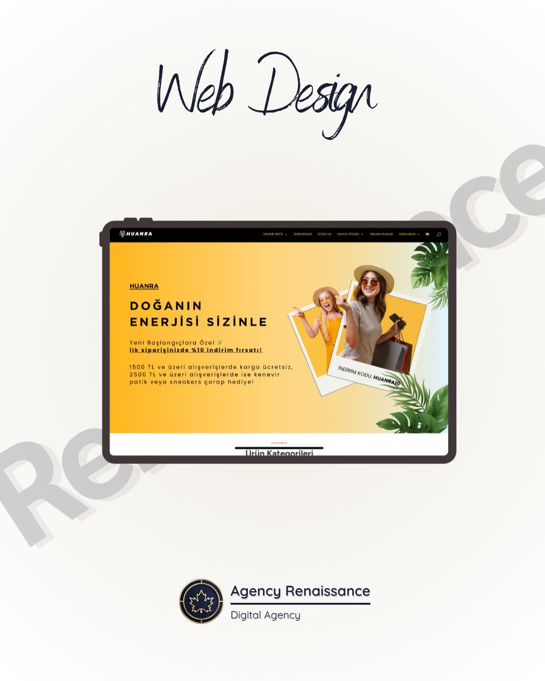
For Huanra, which sells organic textiles and natural products, we built an e-commerce website that carries the message "Nature's energy is with you," and got the brand ready to sell with graphic design, basic SEO and product photo shoots.
Huanra is a brand that offers organic textiles, hemp products, natural stones and accessories. To sell its products online, it needed an e-commerce website that builds trust and also reflects the brand’s natural, energetic spirit.
We approached the site, the visual identity, the search engine groundwork and the product photos as a single project.
Services Provided
Web Design
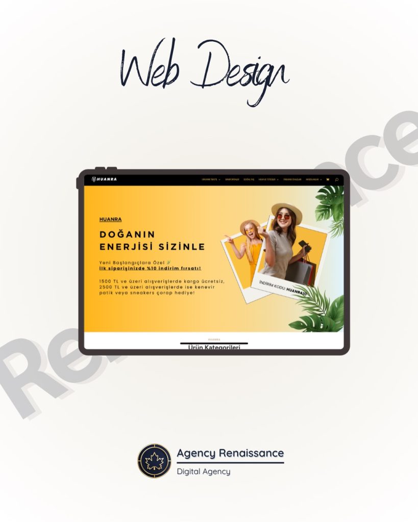
We gathered the product categories (organic textiles, care products, natural stones, accessories) in a clear menu and kept the cart and checkout flow simple. By moving campaigns such as a first-order discount and free shipping into the most visible area of the homepage, we built a structure that guides visitors toward shopping.
Graphic Design
We designed banners and campaign visuals built on yellow tones, tropical leaves and polaroid frames that reflect the brand’s “natural and energetic” stance. The same visual language was used consistently on category pages and in campaign areas.
Basic SEO
We set up the basic SEO elements, including page titles, descriptions, the URL structure of category and product pages, image alt text and site speed, so search engines can crawl and list the site correctly.
Photography
We carried out photo shoots that show the products both on a plain background and in use. These frames were used on product pages, in banners and in campaign visuals, so the site is presented with an original visual identity from start to finish.
Project Summary
Client: Huanra
Industry: E-commerce (organic textiles and natural products)
Year: 2024
Services Offered:
- Web Design
- Graphic Design
- Basic SEO
- Product Photography
Result: Huanra started selling with an e-commerce website that puts its campaigns forward, presents its products with original photos and is ready for search engines.
A closer look at the Huanra project
Our work for Huanra is an example of how an e-commerce website is more than a page that lists products. The site, the visual identity, the search engine groundwork and the product photos were handled as a single project. Below we explain how each part contributes to sales and what brands that sell natural products should pay attention to.
Starting point
Huanra’s product range is wide, from organic textiles to hemp products and from natural stones to accessories. For the brand to sell online, it needed a site that did two things at once: build confidence in shopping and convey the brand’s natural, energetic character. The site was built to carry the brand’s message, “Nature’s energy is with you.”
For brands selling in a niche area, these two needs complement each other. The visitor is most likely seeing the brand for the first time, and has to be convinced the site is trustworthy before entering payment details. On the other hand, to stand apart from similar products on marketplaces, the brand needs a character of its own.
The benefit of bringing four services into one project
When the site, graphic design, SEO and photography are spread across different teams, each part may be right on its own and the whole can still be inconsistent. Photos do not fit the banner sizes, category names clash with the SEO plan, and the visual language changes from page to page. This is why we handled these four jobs as one project on Huanra: so that every decision is made with the others in mind.
E-commerce website design: the structure we built for Huanra
Good e-commerce website design focuses on shortening every step, from the visitor finding the product to completing the payment. On the Huanra site we built this goal on three decisions: a clear category menu, a simple cart and checkout flow, and visible placement of campaigns.
A clear category menu
The menu has four main groups: natural stones, organic textiles, accessories and care products. For a brand that sells different product groups, the menu gives visitors the first answer to the question “what is here?” Writing category names in the language buyers use makes it easier both to navigate and for search engines to understand the pages.
A simple cart and checkout flow
We kept the cart and checkout steps simple. The payment stage is where visitors give up most easily in e-commerce; unnecessary fields, unexpected steps or unclear shipping information can make people abandon a purchase. That is why, in e-commerce website design, we prefer to keep checkout pages short and easy to follow rather than decorate them. Showing the total, the shipping fee and the applied discount clearly in the cart also prevents surprises at the last step.
Campaigns in a visible position
The area seen at first glance on the homepage was given to campaigns: a discount on the first order and free shipping. For a visitor who has just met the brand, the first-order discount makes the decision to try easier, and free shipping reduces hesitation at the cart stage. Seeing the campaign message as soon as the page opens is an important part of a structure that guides visitors toward shopping.
Details that build trust
A visitor shopping from a newly discovered brand looks for a few signs before paying: contact details that can be reached, clear shipping and return terms, and secure payment options. In Turkey, websites that sell remotely are also required to provide pre-contract information and contract terms. When these elements sit in easy-to-find places in e-commerce website design, they reduce the visitor’s hesitation.
The live store is online at huanra.com.
Visual identity: yellow, leaves and polaroids
Three elements come together in Huanra’s banners and campaign visuals: different shades of yellow, tropical leaf patterns and polaroid frames. These choices directly reflect the brand’s “natural and energetic” stance: yellow stands for energy, leaves for nature, and polaroid frames for a warm, personal touch.
This language did not stay on the homepage; category pages and campaign areas were designed along the same lines. On an e-commerce site, if the homepage is strong and the inner pages look ordinary, the visitor feels as if they are browsing two different stores. A consistent visual language keeps the brand the same throughout the shopping trip.
Standing apart from marketplaces
Products such as organic textiles or natural stones are also sold on marketplaces. There, products are listed side by side in the same template and the brand stays in the background. On its own e-commerce site, the brand can present the product with its own story and visual language. Huanra’s original visual identity is the main tool for creating this difference.
Basic SEO: a start that is ready for search engines
When an e-commerce site goes live, search engines need to crawl it correctly and understand its pages. On the Huanra site we set up the basic SEO elements for this purpose:
- Page titles and descriptions: The title and description text shown in search results should be meaningful for each page.
- URL structure: Category and product pages should have readable, orderly addresses.
- Image alt text: What product images show should be described to search engines in text.
- Site speed: Pages should load quickly; this matters for both visitor experience and crawling.
What comes after the basic settings?
Once the basic settings are complete, the work that grows visibility is mostly on the content side. Writing product descriptions from scratch instead of copying supplier text, adding short descriptions to category pages that answer buyers’ questions, and preparing guide content that explains how products are used are the steps we recommend most often in this area.
Basic SEO means the site starts on solid ground; it is not a ranking guarantee. Search visibility develops over time with content, user experience and regular work. Google’s documentation on SEO best practices for ecommerce sites is an official reference on this, and we describe longer-term work in our SEO service.
Product photos: plain background and use in context
The Huanra shoots were set up in two ways: plain background frames where the product appears on its own, and frames where the product is seen in use. The resulting photos were used everywhere on the site, from product pages to banners, so the site opened with its own photos and a look that belongs to it.
Two types of shot, two different jobs
- Plain background: It shows the color, texture and details of the product without distraction. Visitors use these frames when comparing products.
- In use: It shows how the product looks in real life. How a textile item looks in use or how an accessory is worn makes the buying decision easier.
Before the shoot day, having products clean, ironed and free of tags, listing which angles each product needs, and planning the location or model for the in-use frames all directly affect how productive the shoot is.
When shopping online, you cannot touch the product; the photo is the main tool that makes up for this. For products with natural textures, such as textiles and stone, setting up the light correctly is decisive for how close to real the color looks on screen. We describe this process in detail on our product photography page.
Practical takeaways for brands that sell natural products
For a brand that sells organic or natural products, here are the recommendations we took from the Huanra process:
- Settle the brand message in one sentence. A short sentence like “Nature’s energy is with you” guides every decision, from color to photography.
- Do not hide the campaign. Offers such as a first-order discount or free shipping only work when they are seen.
- Keep checkout simple. Every unnecessary field in the payment step raises the chance that the shopper abandons the purchase.
- Use your own photos. Supplier images do not set you apart from other sites selling the same product.
- Set up SEO from the start. Changing the structure of titles, URLs and alt text after launch is more work than getting it right at the beginning.
- Be measured in product descriptions. With natural products, avoiding health or effect claims that cannot be proven protects consumer trust.
What should be ready before launch
Before starting on e-commerce website design, having the product list, category structure, prices, stock information, shipping and return terms, logo and brand colors, and the products to be sent to the shoot ready speeds up the process. Deciding in advance on the campaigns to be used at launch also firms up the homepage design.
You can find our general approach to e-commerce projects on our e-commerce websites service page.
Frequently asked questions
Which services were provided for Huanra?
In 2024 we carried out web design, graphic design, basic SEO and product photography for Huanra as a single project. At the end of this work, the brand went live with an e-commerce website that is ready to sell.
What is the most important step in e-commerce website design?
It is hard to single out one step, but the cart and checkout flow is the most critical part. It is where visitors give up most easily, so checkout pages need to be simple and easy to follow.
What does basic SEO cover?
Basic SEO covers the titles and descriptions shown in search results, readable page addresses, image alt text and page speed. The aim is for the site to be crawled and listed correctly in search engines.
Why are product photos shot in two different ways?
Plain background frames show the detail of the product, and in-use frames show how it looks in real life. Together they help a buyer who cannot touch the product make a decision.
Where are campaigns shown on the Huanra site?
On Huanra, the first-order discount and free shipping offers sit in the part of the homepage that is seen at first glance. Campaign visuals are also used on category pages in the same visual language.
If I sell on a marketplace, do I still need my own e-commerce website?
Marketplaces can be a good sales channel, but they leave the brand in the background. Your own e-commerce website lets you present your products with your own visual language and your own campaigns.
Let’s get your brand ready to sell
If you sell natural, organic or niche products and want to handle the site, the visual identity, basic SEO and product photos in one project, we can look at your needs together. In the first conversation we talk through your product range, your target audience and your sales channels, and decide together which step makes sense to start with. To talk about your project, reach us through our contact page.
Other projects
-
 Hasret Doğan Pilates
The brand's digital identity was fully renewed and given a modern, professional and trustworthy look. The website, social media accounts and ad…
-
 Celebrity Kiev
During its opening we built the digital foundation of Celebrity, a Turkish restaurant in Kyiv focused on meat and fish, from end…
-
 KPS Lamine
For laminate flooring maker KPS Lamine we prepared a corporate website that brings out the natural texture of wood, sorts the product…