KPS Lamine
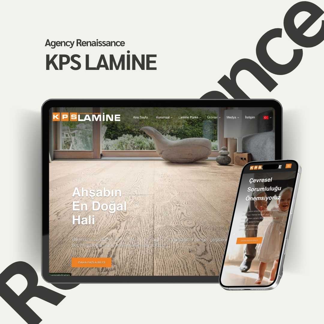
For laminate flooring maker KPS Lamine we prepared a corporate website that brings out the natural texture of wood, sorts the product range into categories and makes the same impression on mobile, along with the graphic designs that go with it.
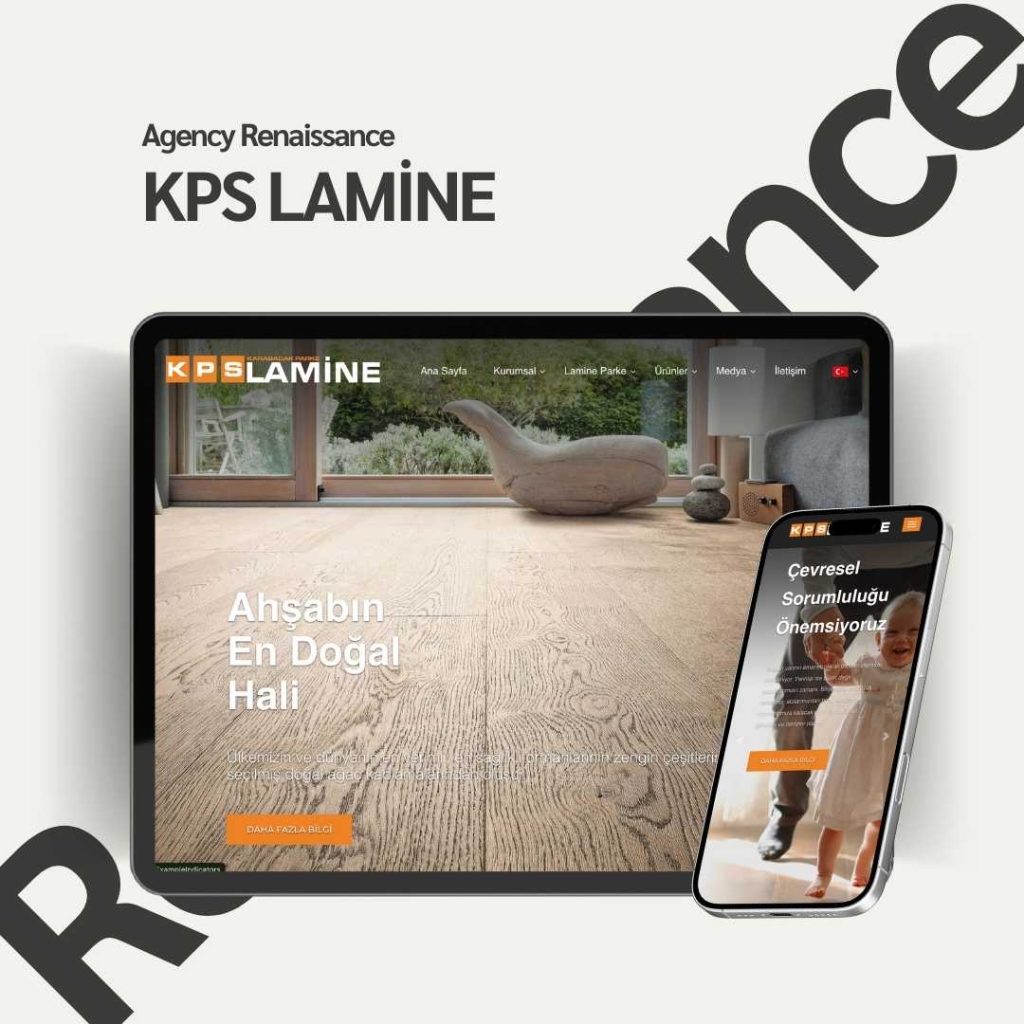
KPS Lamine is a brand that makes and sells laminate flooring under the Karabacak Parke umbrella. The product’s main selling point is visual: the texture and color of wood and the warmth it brings to a space. So the job of the website was to show visitors the product inside a lived-in space rather than on a catalog page.
We prepared, from start to finish, the website that carries the brand’s corporate identity online and the graphic designs used on the site.
Services Provided
Web Design
We built the homepage on wide photos of interiors and short, strong messages such as “Wood at Its Most Natural.” We kept the menu simple with the headings Corporate, Laminate Flooring, Products and Media, so visitors can reach the product group they want in two clicks. The site was designed to keep the same airy feel on tablets and phones, and it was built to support a multilingual structure.
Graphic Design
We prepared the banners, product category visuals and campaign areas used on the site in the brand’s orange and anthracite color language. We presented brand messages such as environmental responsibility in the same visual language, so the site speaks with a single identity from start to finish.
Project Summary
Client: KPS Lamine — Karabacak Parke
Industry: Building materials (laminate flooring)
Year: 2024
Services Offered:
- Web Design
- Graphic Design
Result: KPS Lamine now has a modern, mobile-friendly corporate website that shows its products in interiors, and dealers and end customers can browse the product range comfortably from a single address.
A closer look at the KPS Lamine project
The corporate website we prepared for KPS Lamine rests on a clear idea of how a building materials brand should present its product: show flooring not as a line in a product list but as part of a lived-in space. Below we share the thinking behind the design decisions and the main lessons for companies that make building materials.
Starting point
KPS Lamine, a brand under Karabacak Parke, both makes and sells laminate flooring. What convinces the buyer of this product is largely what the eye can see: the texture of the wood, the color tone and the warmth it brings to a room. The brand needed a website that carries its corporate identity online and lets both dealers and end customers browse the product range comfortably. Within the project, we were responsible for the design of the website and all the graphic work on it.
Why should a flooring company website be more than a catalog?
Choosing flooring is often a decision about the whole space. The buyer wants to see not only the color but how that color will look in a living room, a bedroom or an office. A small sample photo cannot answer this question, while a wide interior photo can.
That is why a flooring company website has to balance a technical product catalog against a showcase that inspires. A site that is too technical tires the end customer, and a site that is only visual cannot offer the order a dealer needs. On the KPS Lamine project, bringing these two audiences together in one structure was the main goal.
Two different visitors, one address
- The end customer looks for a look that suits their home or workplace, and needs inspiration, color options and images of interiors.
- The dealer wants to reach the product range quickly, show it to their customer and see the brand’s corporate stance.
Keeping the menu and category structure simple so that both audiences can easily find what they are looking for is one of the most important decisions for a flooring company website.
Managing the number of options
Laminate flooring collections usually consist of many color and pattern options. If this richness is not organized properly, it turns into confusion for the visitor. Sorting products into meaningful groups, opening each group with a strong image that represents it and leaving the details for the next step makes choosing easier. On the KPS Lamine site, dividing the product range into categories answers this need.
Key design decisions on the KPS Lamine website
A homepage that opens with interior photos
The backbone of the homepage is wide interior photos and short messages such as “Wood at Its Most Natural” that sit on top of them. The moment visitors enter the site, they see the product inside a room; they understand what the brand offers without reading a long introduction. The short messages complete the feeling without getting in front of the image.
A simple menu with four headings
The menu has only four headings: Corporate, Laminate Flooring, Products and Media. Visitors can reach the product group they want in two clicks. A mistake often seen on building materials sites is turning every product feature into its own menu heading, which tires the visitor before they have made a choice.
The same airy feel on tablet and phone
The site was designed to keep the airiness of the desktop version on tablets and phones too. This matters especially for a flooring brand: if large interior photos get squeezed on a small screen, the texture and color, the product’s real strength, are lost. That is why images, text blocks and the menu need to be handled separately in the mobile view.
An infrastructure ready for multiple languages
The KPS Lamine site was built to support a multilingual structure. For a manufacturer, this means that if content in other languages is needed later, the site does not have to be rebuilt. When language versions are added, the hreflang approach in Google’s documentation on localized versions of your pages should be followed, so that search engines show the right version to the right user.
You can reach KPS Lamine’s corporate site at kpslamine.com.
Graphic design: an orange and anthracite color language
All the graphic areas on the site, that is the banners, category visuals and campaign sections, were designed with the brand palette of orange and anthracite. Orange offers a base in tune with the warmth of wood, and anthracite one in tune with corporate seriousness. Used together, the two colors give a look that is both warm and trustworthy.
Brand messages such as environmental responsibility were presented in the same visual language. That way the site speaks with a single identity from the product page to the corporate message. Backing such messages with concrete practices increases the visitor’s trust in the brand.
Category visuals and campaign areas
Product category visuals work like signposts inside the site. When every category is represented with the same light, the same proportions and the same color language, visitors move between groups with ease. Campaign areas let the brand highlight its seasonal messages without disturbing the overall layout of the site. These areas, which we prepared for KPS Lamine, also stayed in the orange and anthracite line.
Carrying the corporate identity online
A manufacturer’s corporate identity usually already exists in printed catalogs, trade fair stands and vehicle wraps. Our job on the website is not to reinvent this identity but to carry it onto the screen correctly: adapting color proportions, typefaces and visual tone to the digital environment. We describe this approach in our corporate identity service, and our view of corporate sites in our corporate web design section.
How do we approach manufacturer websites?
When we work with companies that make building materials, we usually take the process through five steps. At the end of each step we get the company’s approval before moving to the next, so there is no surprise change of direction once the design is finished.
- Discovery: We review the product range, the target audiences and the brand’s existing corporate identity together.
- Site map: We plan the menu headings and category structure so that visitors reach the product by the shortest route.
- Visual language: We define color proportions, the banner layout and the shared look of the category visuals.
- Design: We handle the desktop, tablet and phone views separately.
- Launch: We place the content, test on different devices and take the site live.
This order prevents from the start the issue that costs the most time on a flooring company website, which is the product structure changing during design.
Practical takeaways for building materials brands
If you make flooring, ceramics, doors or similar building materials, these principles that stood out on the KPS Lamine site apply to you too:
- Show the product in a space. Sample images work on category pages, but interior photos are far stronger on the homepage and in promotional areas.
- Build the menu the way the buyer thinks. The buyer starts from the product group; set up a menu around your product range, not around your internal structure or production line.
- Tell dealers and end customers apart on the same site. Both audiences need to be able to find their own way easily.
- Design the mobile view separately. Someone looking at the site on a phone in a showroom or on a construction site should see an image as clear as on the desktop.
- Choose the infrastructure with growth in mind. Even if you publish in one language today, an infrastructure that supports multiple languages will make things easier later.
Common mistakes
These are the problems we run into most often when a flooring company website is being prepared:
- Using product images that are low resolution or shot under different lighting.
- Leaving the product range only to a downloadable PDF catalog; visitors do not want to read a PDF on a phone.
- Writing color and pattern names differently on the site, in the catalog and in the dealer list.
- Burying contact and dealer information deep in the site.
Preparation list: which materials are needed?
For a flooring company website, the most valuable material is high-resolution photos of the spaces where the products are installed. Beyond that, having the list of product groups, color and pattern names, technical specifications if any, logo and corporate color files, and dealer contact details ready speeds up the process. Deciding in advance which products will be featured on the homepage also firms up the design.
For another example of a manufacturer’s site that sorts its products into categories, you can look at our Atlass Metal project.
Frequently asked questions
What work was done for KPS Lamine?
For KPS Lamine we ran web design and graphic design services from start to finish in 2024. Along with the corporate website, the banners, product category visuals and campaign areas used on the site were prepared as part of this work.
Which sections should a flooring company website have?
The basics are enough: corporate information, product groups, product details and contact sections. On the KPS Lamine site this need was met with a simple menu of four headings: Corporate, Laminate Flooring, Products and Media.
Why should flooring products be presented with interior photos?
The value of flooring lies in its texture, its color and the warmth it brings to a space. An interior photo makes it easier for the buyer to imagine how the product will look in their own home or workplace.
What does a site that supports a multilingual structure mean?
It means the site is built so that content in other languages can be added later. That way, when a new language version is needed, the site is not rebuilt but added to the existing structure.
What should a manufacturer’s website with a dealer network pay attention to?
The product range should be organized so that dealers can easily show it to their customers, and contact details should be easy to find. The KPS Lamine site brings dealers and end customers together under one roof, at the start of the same product range.
Why is graphic design handled separately on a corporate website?
Banners, category visuals and campaign areas set the first impression of a site. Preparing these areas in the corporate color language lets the site speak like a single brand from start to finish.
Let’s show your products inside the space
If you make flooring or another building material and want a corporate site that presents your product range clearly to both your dealers and end customers, we can look at your needs together. To talk about your product range and your goals, write to us.
Other projects
-
 Hasret Doğan Pilates
The brand's digital identity was fully renewed and given a modern, professional and trustworthy look. The website, social media accounts and ad…
-
 Celebrity Kiev
During its opening we built the digital foundation of Celebrity, a Turkish restaurant in Kyiv focused on meat and fish, from end…
-
 Huanra
For Huanra, which sells organic textiles and natural products, we built an e-commerce website that carries the message "Nature's energy is with…